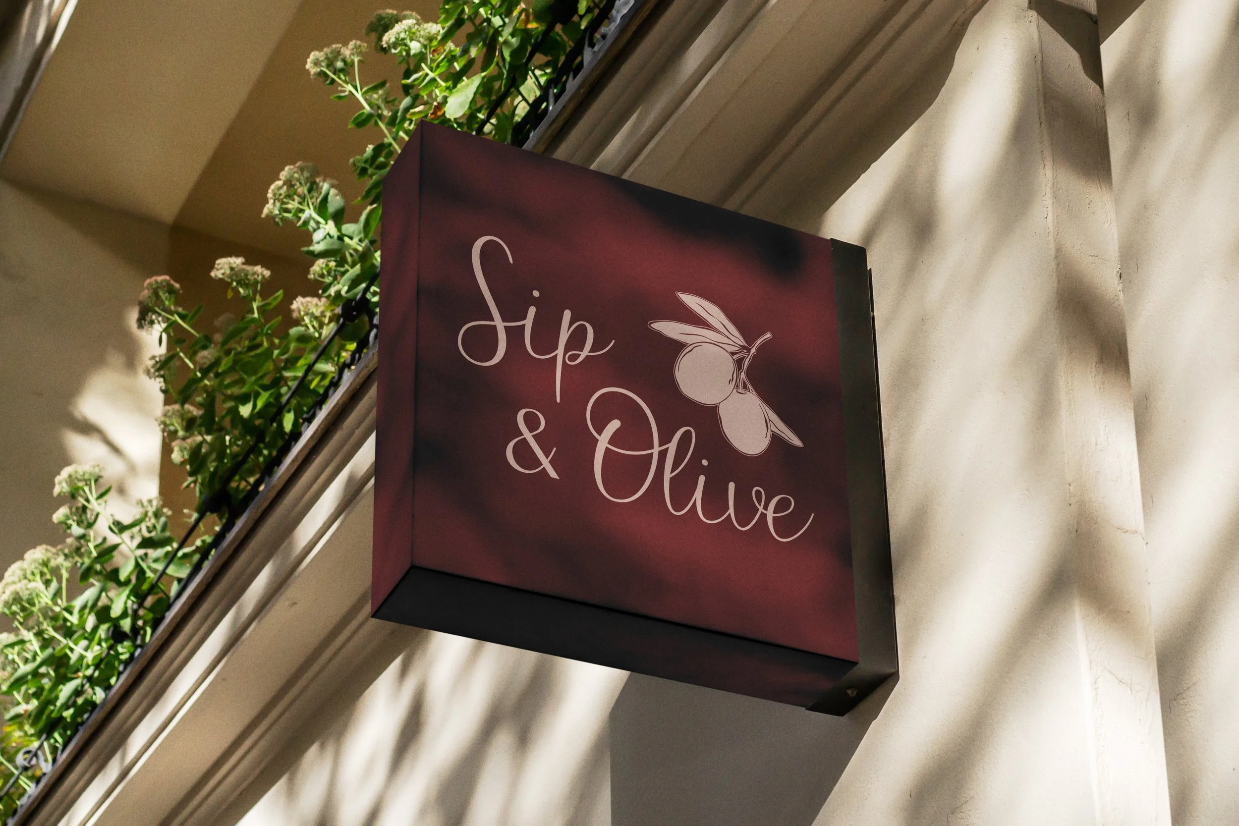
SIP & OLIVE
PROJECT AT A GLANCE:
I was tasked with designing a flexible logo identity that can evolve with the business as it expands into new areas such as home entertainment and wine subscriptions. The Founder wanted the identity to be distinctive yet adaptable across future sub-brands. In addition, create a set of custom illustrations that feel human, warm, and imperfect, drawing inspiration from La Dolce Vita-style ink illustrations. These visuals should capture a sense of charm and personality while maintaining consistency with the overarching brand aesthetic.
SIP & OLIVE Wine bar will be opening in Earls Barton Village: September 2025
LOGOS
I designed a versatile logo with a built-in adaptable element, allowing future designers to seamlessly update the graphic as the brand grows and evolves.
Deliverables: Primary, Secondary and brand mark; bespoke hand-drawn illustrations; bespoke branded patterns; brand guidelines.
PRIMARY
SECONDARY
ICON
BESPOKE HAND DRAWN ILUSTRATIONS
My illustration process began with real-life objects and photo references, which I translated into simple line iPad sketches. These were then refined and converted into scalable vector artwork in Illustrator, balancing hand-drawn character with digital precision. These illustration were created to become part of the brand idenity as well as to be used for printed collateral such as grease proof baking paper.


